2D Graphics Manual
Your 101 introduction to creating your own 2D assets using your 3D art.
Introduction
All 2D strategy games use seamless tiles to build their environments. Most of this art is either illustrated or produced in 3D programs. This includes famous games like Clash of Clans or Command and Conquer: Red Alert. Huge environments can be built from relatively small sprite atlases. Each sprite can be flipped horizontally or vertically, for variation. The 3D appearance of the environment is a clever illusion, and the repetitive tiles are almost unnoticeable.
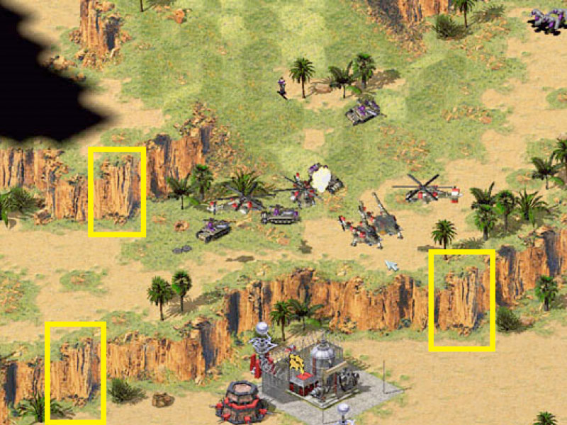
Click on image to view larger. Command & Conquer - Red Alert 2 - Yuri's Revenge (2001)
Mobile's Limited Memory & Efficient Tiling
iPhones/iPod Touches/iPads all have a Unified Memory Architecture which mean that both the CPU and GPU share system memory. There is no dedicated video memory on these devices. Here's a breakdown of the memory on older devices you might still be targeting:
| iPhone 4S | 512 MB of RAM |
| iPhone 5 - iPad 3 - iPhone6 | 1 GB of RAM |
| iPhone 7 / 7 Plus | 2-3 GB of Ram |
The reason for using a tiled environment and not a pre-rendered, high quality image is that a single 1024x1024 px ARGB32 Texture2D can use up to 4-8MB of memory. Now considering the limited RAM seen above, you can see why it's important to keep texture sizes down?
Click on image to view larger.
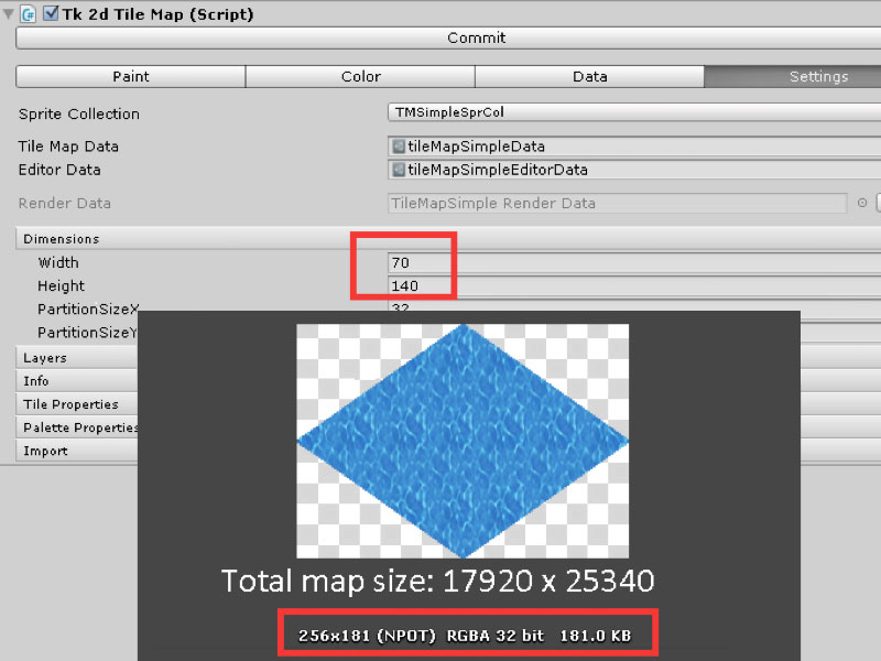
Our island tile map example has a size of 17920 x 25340 px, each tile has 256x181 px. So without using tiles, a lot of memory would be consumed by the map alone.
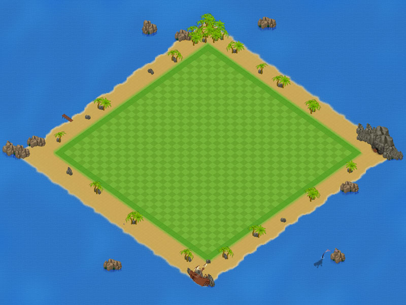
Click on image to view larger
But with tiles, the source image of the entire base environment layer is a single 1024 px image, and the tiles are diced to reduce the total size of the image atlas/sprite collection.
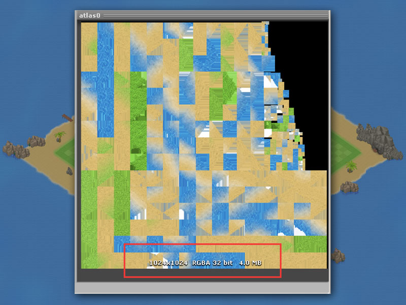
Click on image to view larger
Imagine the efficiency!
Our Game Stats
All the space saving techniques we're about to mention have lead to amazing performance on our mobile 2D game engine. See our stats – for explanations for each element, please see Unity's Rendering Statistics Documentation
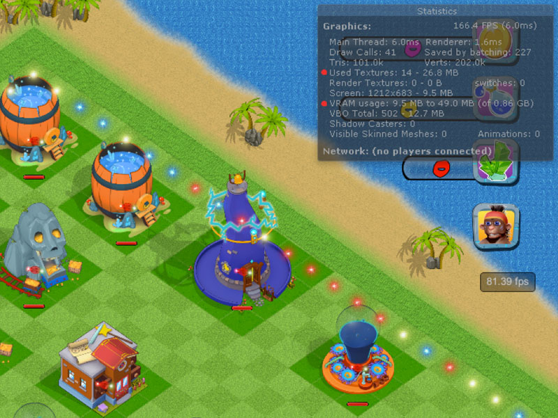
Click on image to view larger. Unity Rendering Stats of the Pro Kit
For example, to preserve performance, the UI is updated only when necessary - something happens in the game - "event based", if you will call it, although events has a different, specific meaning in programming. For example, when construction is finished in ConstructionSelector.cs, we call a reference to update the UI. By doing this when the event is complete, rather than regularly, massive performance improvements can be made.
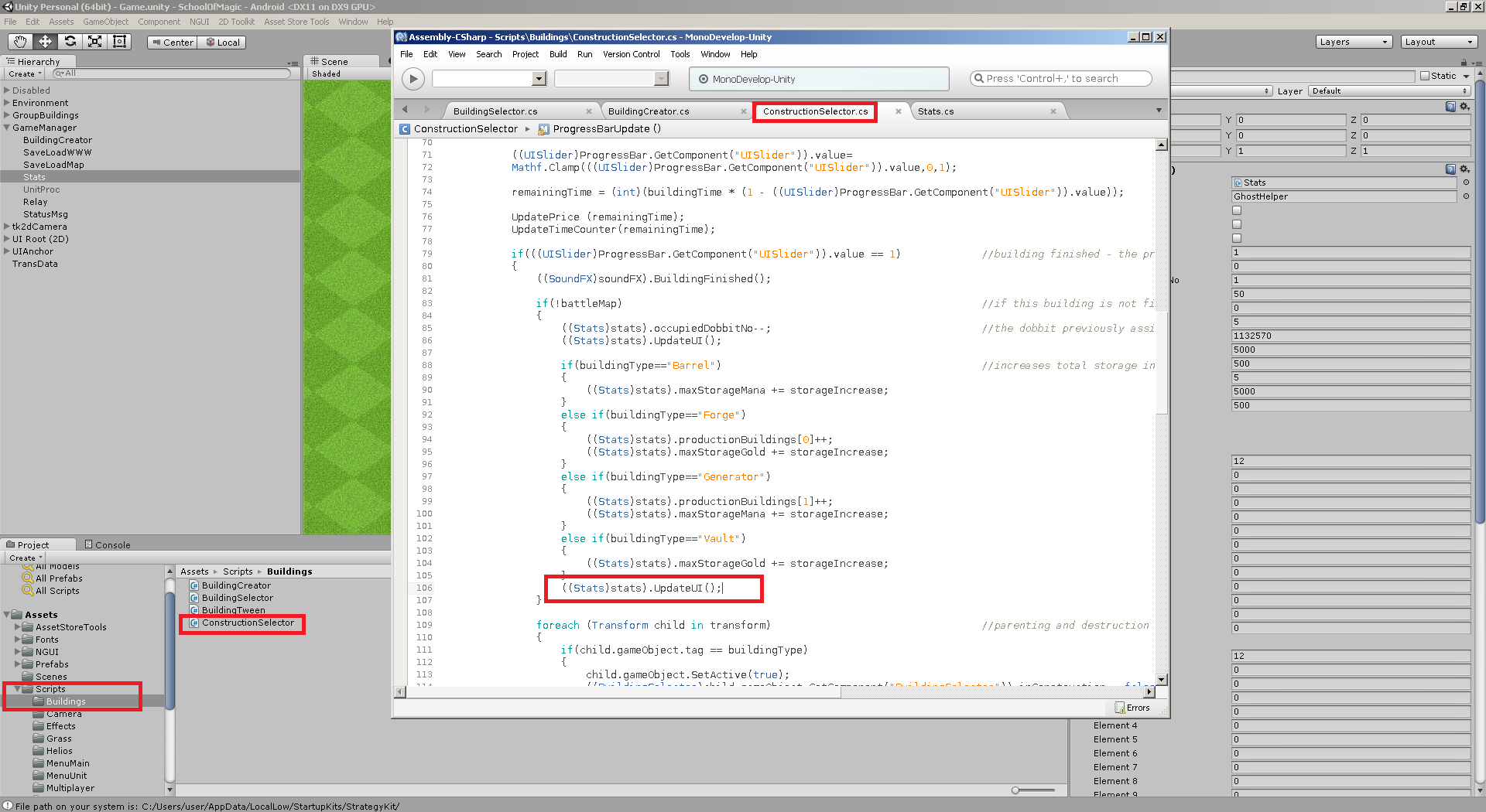
Click on image to view larger. UpdateUI is called when a building finishes to increase performance.
Clipped Sprites
Unfortunately, the base environment is only one of many elements who will take up video/unified memory.
What 2D Toolkit does
The buildings and environment elements are stored as is, with 2D Toolkit making best use of the image surface by rotating and stacking them in the most efficient positions. The apparent defects are just artifacts who appear in transparent areas – the images are, in fact, perfectly clean. To avoid a clean, plane appearance, for variation, dirt, darker areas, transparent sprites can be added as decals over the base tiles.
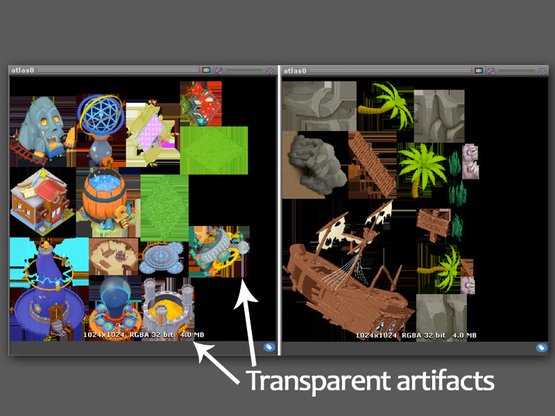
Click on image to view larger. 2D Toolkit atlas file
Scaling Graphics to Save Space
Another technique commonly used to save space is to scale some of the graphics at twice the size– this is the reason buildings and characters may appear a little fuzzy in some games, due to the bilinear/trilinear filtering – the grass here is a perfect example:
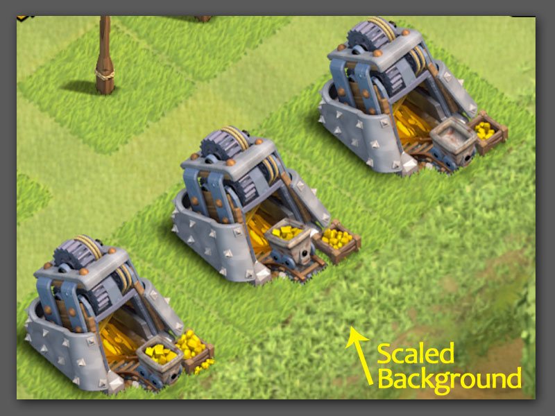
Click on image to view larger. Clash of Clans
Seamless isometric tiles
The base environment is composed of several seamless isometric tiles. There are numerous tutorials for creating seamless tiles, square or isometric, in either Photoshop or Gimp. There are simple tiles representing a single element – sand, grass, water - and transition tiles, from grass to sand, for instance. You can also play with irregular, winding shapes by copying and flipping the gradient masks.
This is the structure of our isometric tiles, marked with the help of our pathfinder grid.
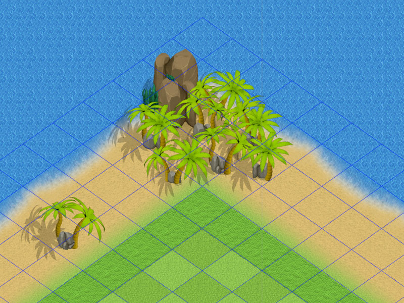
Click on image to view larger. iso tilegrid in our mobile game kit
Creating Tiles
You can create tiles easily. Here's how to do this with the free image editor GIMP. For simple isometric tiles, start from a 256x181 image. Although we recommend you work in a higher resolution while keeping it in the same proportion like 512x362(twice of 256x181) and scale it down. This can make for a better quality image.
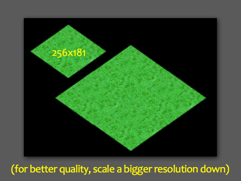
Click on image to view larger
-
Create a black/transparency layer with the intended texture shape – a black, hollow rotated square
-
Insert a small grass texture in a separate layer
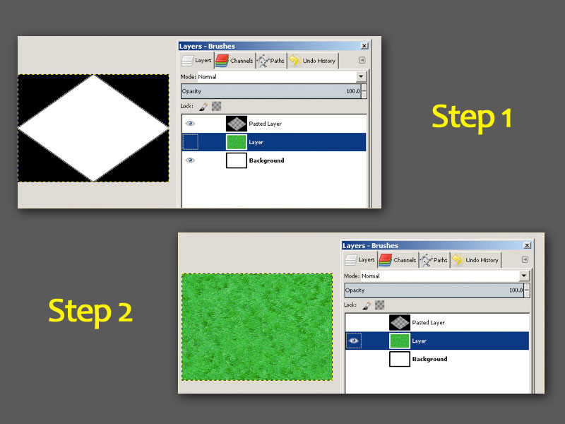
Click on image to view larger
- Offset it by half and erase the seams, if necessary – vertical/horizontal edges might be visible in the middle
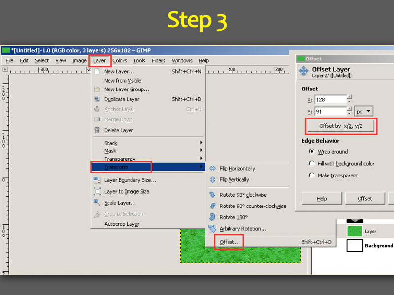
Click on image to view larger
- Insert a layer mask and paste the black/transparency layer
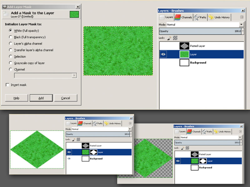
Click on image to view larger
- Export the tile. 2D Toolkit will use separate tiles to build the atlas
Tip: For transition tiles, from grass to sand for instance, you will need to apply a different layer mask, this time with an oblique black and white gradient, which will allow the texture below to become partially visible.
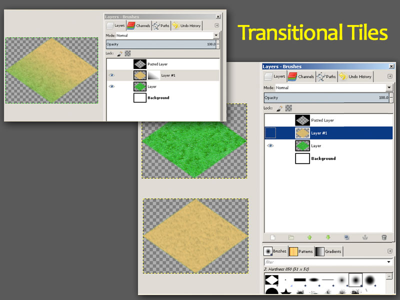
Click on image to view larger
Shadows - Special Tricks and How the City Building Kit Saves Memory
Any shadow in our environment is, in fact, a rotated/scaled sprite with black tint and a lower alpha for transparency. Sometimes, the best shadow of an object can be the sprite of another object, depending on the size and position of the projected shadow. We have created a single irregular shadow for groups of rocks, since no existing sprite could be used for this purpose.
In most cases, the shadow sprites can be very small, to save space, and stretched. Still, you must avoid overlapping shadows, or even partially transparent textures, since the common areas are visible – they become twice as opaque.
Objects can have shadowed sides, or shadows in the foliage for high quality renders. What you will not need are the large shadows on the ground, or on walls – storing those for your objects would be a waste of resources. In most cases. they can be recreated from the same sprites, clipped or flipped as needed, with a black tint and a decreased alpha.
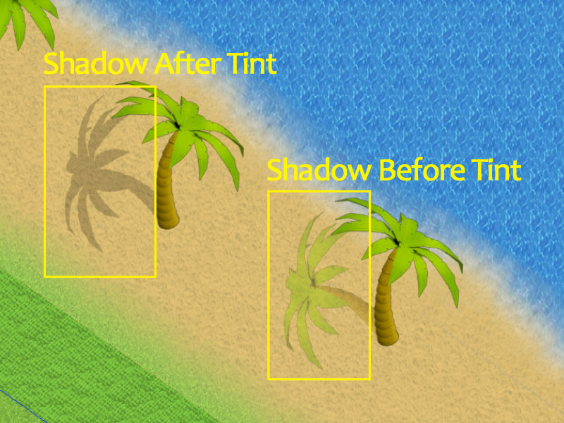
Click on image to view larger
Vegetation
You can also consider storing your vegetation into separate elements – they are much easier to combine in different sizes, since you don't have to hide defects in the clipped sprites, like remaining foliage on a tree trunk, fragments of another trunk visible under foliage, etc.
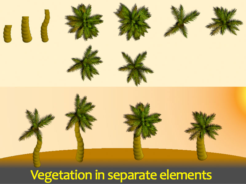
Click on image to view larger
New Kit Owners: Another possibility introduced recently in our kit, is the pivot, or anchor, at the base of vertical objects, which pushes the element slightly towards the camera or back, based on Y position. This allows units to go near such objects, while still appearing correctly behind or in front of them. This Z correction is calculated for all moving units at intervals of 0.3 or 0.5 seconds, and only once for static objects – when they are instantiated.
Recreating Complex Geometry
Most, if not all isometric 2D games graphics are built from 3D rendered environments. Arguably, for the base tiled layer, the rendered environment must be free of all decoration, small objects, gradients, decals (dirt, grass), possibly even shadows. Let's take this image, for instance, ignoring the buildings, vehicles and trees. Say this was a 3D render of your environment.
Every straight line in the rendered image must be consistent with the angle of your isometric tiles, and the position/rotation of the camera must be consistent with any element that will be rendered for your game. Otherwise, buildings will lean in different directions, roads will appear in perspective, etc.
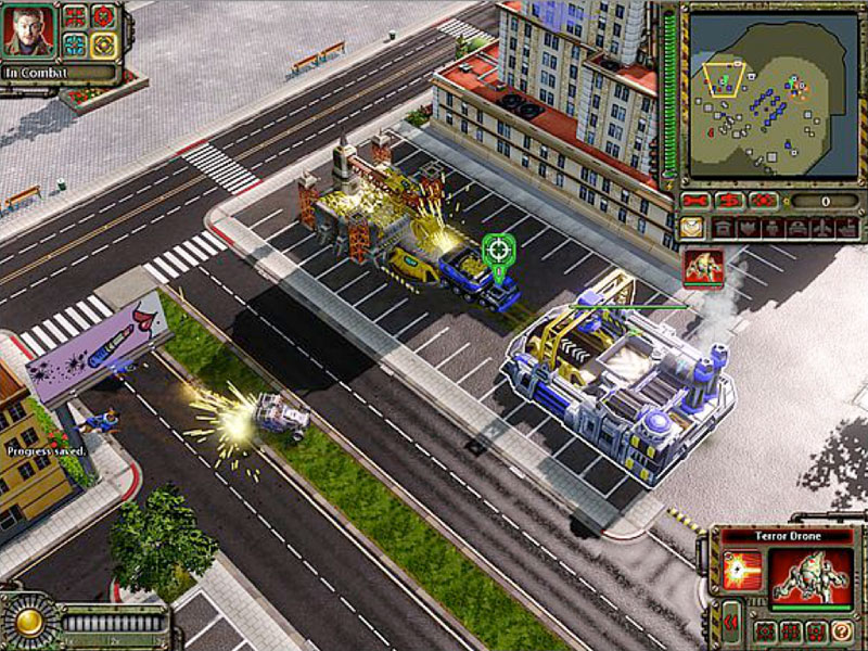
Click on image to view larger. Command and Conquer Red Alert 2
Tutorial GIMP Source Files
For the following How to Make an Isometric Tile Grid tutorial, you can download the GIMP editor source files here and follow along
How to Make an Isometric Tile Grid
For this example, we will use the image above. From this image above, you can extract a few isometric tiles for the pavements, roads, grass patches etc.
- We will start from a single, hollow tile, on a black layer, and a white background to better visualize our tiles.
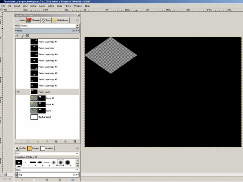
Click on image to view larger
- Duplicate and offset the layer with the width/height of your tiles, until you will have a grid that covers the entire area. Each layer's opacity is set to 10%, so you can see them simultaneously in the example image below.
Again, each separate tile is on a different layer, in a different position. Put these in a folder, if you want, and duplicate one of them. Offset it once with half the tile size, and then keep duplicating and offsetting with the full tile x and y sizes to obtain the other missing tiles (to cover the darker squares between tiles from the first set).
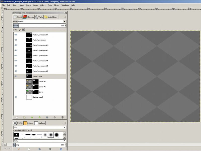
Click on image to view larger
The second group of tiles will look like this:
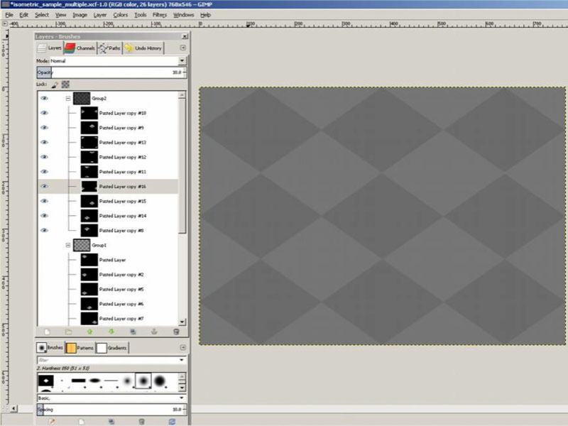
Click on image to view larger
- Now that you've setup the tile grid, you're ready to take your 3D art and paste into it. Paste your render image into a separate layer and duplicate it like:
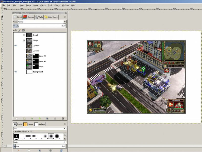
Click on image to view larger
- Find an area of interest, and copy the black layer into an image layer mask.
Note: Obviously for this example, this randomly selected environment/camera are not aligned with our tiles, and there is some perspective effect that will prevent our tiles from fitting in the finished result below, but this will be enough for an example.
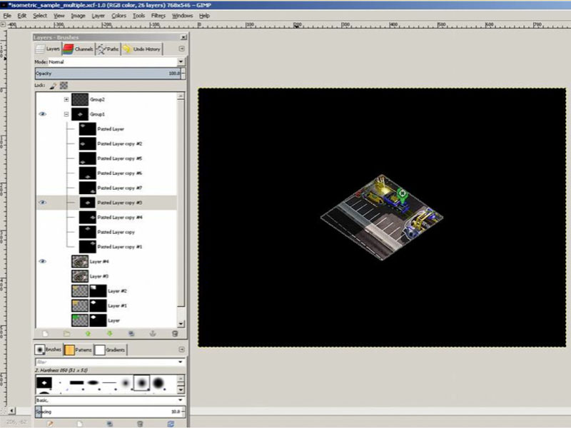
Click on image to view larger. Randomly selected art for the tile
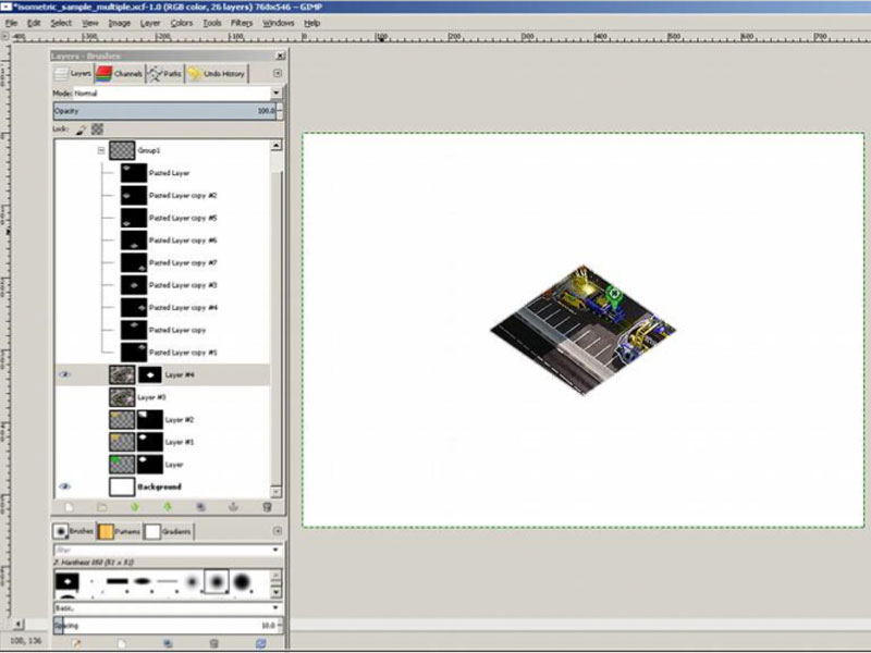
Click on image to view larger. Copying the black layer into the image mask
- Crop the image, disable the white background, and export as png. Undo a back to step 3 to revert to the full image, and repeat the previous steps for other areas.
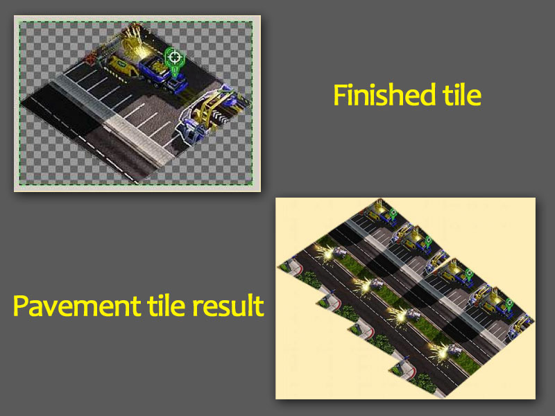
Click on image to view larger
Do this for several other tiles, until you have enough to recreate the road in the middle. With a little help from the perspective tool, to correct the alignment and camera perspective effect, we now have two tiles to create a repeating portion of the road seen in the above result.
Conclusion
You've learned about memory limitation with modern day mobile devices and why 2D games use sprites to render larger maps and tricks with reusing the same sprites to build complex scenes, shadows...
Plus, we've shown you have to create tiles you can use in the kit. Use the above instructions to create your own tile grids from 3D art, then read the terrain documentation to learn how to insert your new terrain asset into the kit.
For customizing building art or building sprites. Please see the building documentation.
Updated less than a minute ago
