Custom Menu UI
Reminder - Keep Daily Backups
When working on a strategy game with a kit as big as the Complete Kit - always keep a working daily backup! Save yourself the trouble of rolling-back changes and losing work.
Where can I edit menus and the UI in the Unity editor?
Almost all UI elements are parented under the UIAnchor game object. Look in the hierarchy > UI Anchors.
We setup the kit for cross-compatability of any interface aspect ratio (landscape, portrait, 720p, 1080p, 4k, etc.) UI panels are anchored to corners or centered. You can test this out by resizing the Unity editor. Changes instantly reflect in the game.
In order to work on any one of the UI menus, please disable the other anchors and focus on the one that interests you.
Adding Your Own Menu Graphics to the Kit
After you insert your own menu source images/sprites (ours are located in Sprites_NGUI), open the atlas maker in NGUI / Open / Atlas Maker and add your own sprites here.
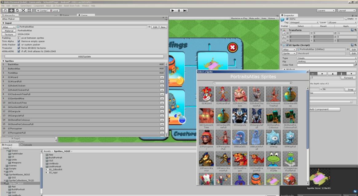
Screenshot from Pro Kit. Same theory applies to Complete Strategy Kit. Click on image to view larger
Don't Remove Existing Sprites
We recommend leaving the kit's existing sprites till a later stage, since deleting them from the start would make a lot of interfaces appear incorrectly, with missing elements, etc.
About the HUD UI
See the screenshot below for a summary of the different buttons included on the player's main HUD
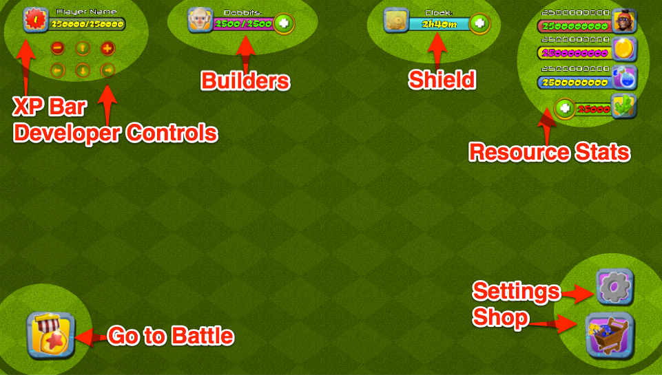
HUD. Click to view larger.
The buttons you see on the HUD parented under the UIAnchor game objects. Look in the hierarchy > UI Anchors. You'll see the
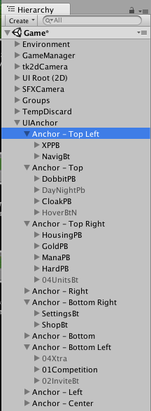
List of game menus in Anchors. Click to view larger.
Anchors Item Naming Conventions
Just so you understand the names in the below list
PB means Progress Bar
Bt means Button
| Label | Anchor Location | Description |
|---|---|---|
| XPPB | Anchor - Top Left | The XP progress bar and player XP level number. Value increases as buildings are produced and XP is gained. See XP documentation page for more details. |
| NavigBt | Anchor - Top Left | Unity Editor developer controls. For instructions how to remove, see Scroll and Zoom for Developers documentation page. Use these arrows or zoom buttons for movement on non-iOS devices such as a desktop test. Hide in gameplay after development in this Unity Development Kit. |
| DobbitPB | Anchor - Top | Progress bar of builders available and purchase more shop button. (Opens Shop Resources menu) |
| CloakPB | Anchor - Top | Shield timer progress bar and purchase more shop button. (Opens Shop Shield menu) See Shield page in the docs. |
| HousingPB | Anchor - Top Right | Total player army count progress bar. |
| GoldPB | Anchor - Top Right | Total player currency #1 count progress bar. |
| ManaPB | Anchor - Top Right | Total player currency #2 count progress bar. |
| HardPB | Anchor - Top Right | Total player rare currency count progress bar plus purchase more shop button. (Opens Shop IAP menu) |
| SettingsBt | Anchor - Bottom Right | Settings button, opens settings menu. (Anchor - Center: Settings) |
| ShopBt | Anchor - Bottom Right | Shop button, opens shop menu. (Anchor - Center: Shop) |
| Competition | Anchor - Bottom Left | Go to battle button, opens Army menu. (Anchor - Center: Army) |
How to increase the size of the UI
Does the UI appear too small (see below screenshot) for your platform? Follow these steps to change the size to match your platform.
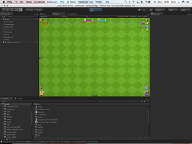
Example of the small UI for a particular platform. Click to view larger
If you want the interface to appear larger on any particular platform, modify the size of the projection up to the point where the elements start overlapping each other. See the below screenshot.
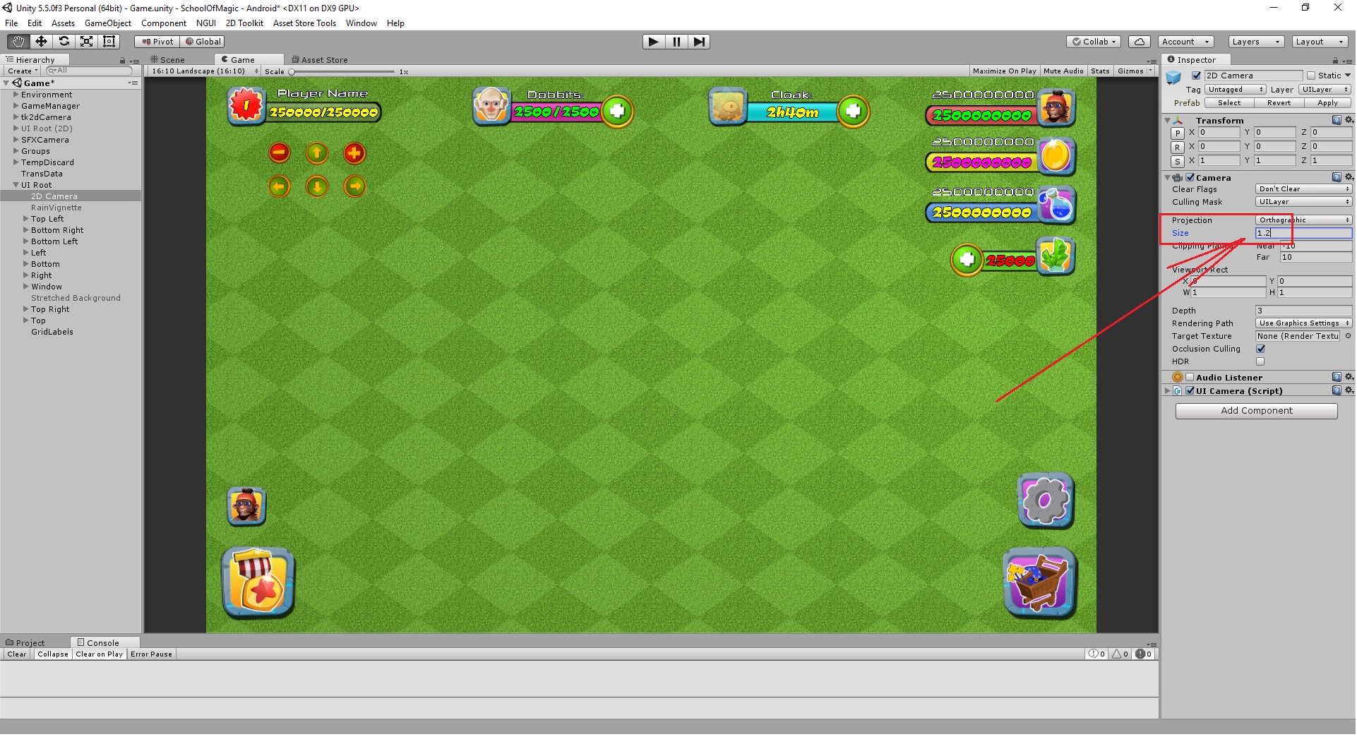
Click to view larger
Now, we run the scene again and see the UI increased in size:
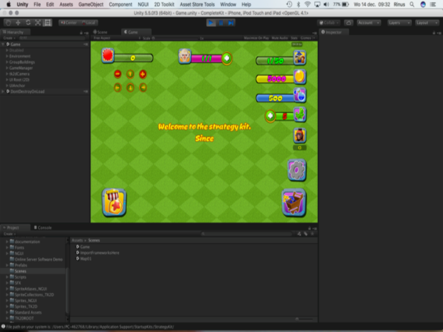
Fixed UI size. Click to view larger
How to hide UI items
The following video tutorial shows you how easy it is to hide UI items in the City Building Kit.
Menu UI Backgrounds
Our backgrounds are tiled – composed of many small elements. The sprites are located in BackAtlas – you can insert your own, and assuming they have other sizes than 64x64px, make sure you change the Edit/Snap Settings to position them more easily.
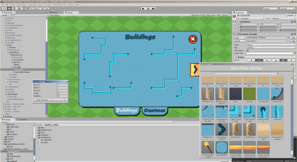
Screenshot from Pro Kit menu. Same theory applies to Complete Strategy Kit. Click on image to view larger
Also, observe that there are some large background sprites – CheckerBk and CheckerBkShadow, to avoid the square checker appearance of the menus – because the backgrounds are tiled, you can see through some green lines from the grass underneath in some portions – although they are aligned with snap, the 'cracks' remain visible.
Layer Depth (for shadows and other objects)
Layers allow you to have shadows behind your menu, or objects like text on top of your menu. The below screenshot is from the Pro Kit menu but the same theory applies to all of our kits including the Complete Strategy Kit.
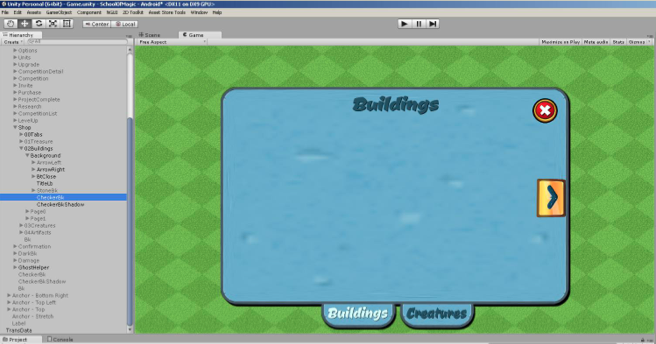
Click on image to view larger
If at any time, the elements of your new buttons don't appear properly in the background/foreground, change the layer depth of the elements/their parents. They can be quite stubborn sometimes, but they can be fixed.
Sharing Layer Depth
Pay attention to the layer depth. Having two visible elements on the same depth might appear correctly in the editor, but then flip at run-time (or any other time) like the below screenshot.
If at any time, the elements of your new buttons don't appear properly in the background/foreground, change the layer depth of the elements/their parents.
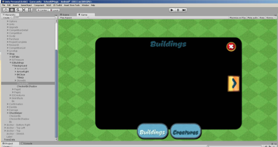
Flipped layers. Click on image to view larger
Custom Menu UI
Following the tips above, you can create your own custom menus quickly by changing the existing graphics in each anchor. In the below screenshot example, we've customized the Pro Kit for a farming game.
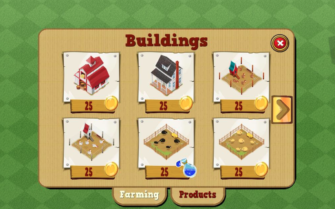
Click on image to view larger
Farming Game Source Code
Customers can contact us to see our farming game kit development demo which shows a customized menu like seen above.
Updated less than a minute ago
